
Can we talk covers for a moment? I’m still not over the darling cover art Turner Publishing came up with for Mammoth:

I have ALL THE APPRECIATION AND GRATITUDE for creative director Madeline Cothren and artist Jo Walker because this design still makes me fall in love every time I see it. Mammoth is about hard, unyielding things — fossils, the reception women receive in male-dominated fields, the kind of raw ambition that can result in reckless decisions — but it’s also a soft, sweet, optimistic story about discovery and vulnerability and love. Somehow, this cover captures both sides of the narrative.
I mean, come on — a heart made out of half-buried mammoth bones? It couldn’t be more perfect. I SWOON.
However, Mammoth almost looked completely different.
Several years ago, when I was unagented, I considered self-publishing Mammoth. I held off because I couldn’t come up with a cover concept I liked, so I never got as far as commissioning an artist/designer to create anything for me. I knew I didn’t want a photograph of a model meant to look like Natalie (the book’s main character, plus-size fashion blogger, and resident paleontology geek). I liked the idea of representing Natalie without actually depicting her, so in early 2016 I played around with this mock-up in Photoshop:
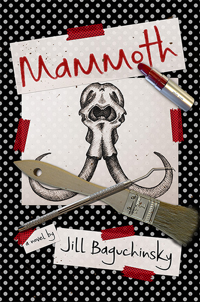
Totally different! A pair of dig site tools and some random bits of dirt scatter over a skull image from one of Natalie’s sketchbooks. (She usually sketches fashion ideas, but I can totally imagine her drawing a fossil here and there.) The title’s scribbled with Natalie’s signature lipstick. There are retro-inspired polka-dots and a black/white/red color scheme Aunt Judy would adore. There’s a bit of a skull-and-crossbones theme representing how Natalie occasionally goes rogue when a paleo discovery’s at stake. But overall . . . It’s harsh. This design is like Natalie early in the book, when she’s strong and flawless on the outside, but there’s no hint of the evolution she undergoes during her time at the dig site. The story’s softness is missing. I never moved forward with this concept, obviously, and I’m glad I didn’t. (Especially since I made such a mess of the brush bristles in Photoshop! I’m definitely an amateur when it comes to design.)
It wasn’t a total loss, though. I’ve gotten to recycle a few of its elements in swag designs. My skull sketch is on bookmarks, info cards, buttons…

Mammoth had to wait a few more years for a perfect cover, but it has one now. ❤
(If you like its final cover design, why not add Mammoth on Goodreads?)
